Boosting conversion rates is a constant battle for marketers. According to data collected by Snap Agency, businesses are spending $75,000 on marketing every year, on average.
That’s a huge money pit that could be going to waste if you’re not convincing people to buy.
My team and I were looking for a way to create substantial growth without needing an acquisition. Instead, we focused on our conversion rate, starting with the form. We asked ourselves; “how can we not only increase the number of people who sign up, but make it enjoyable in the process?”
Here’s how we did it.
The Background Story
This journey began back when my company in the forex broker comparison niche, BrokerNotes didn’t have a huge amount of organic traffic to boast. Nor was it a prominent brand name at the time.
Combine that with the fact we’re operating within a very competitive niche (the term “forex brokers” is £40 per click in Google AdWords), and you’d probably understand why it was so important for us to make sure the basics were spot-on before pouring more money into acquisition.
We needed a huge percentage of the people visiting our site to convert to make it worth our while.
The one thing standing between traffic and conversions was our form. So we got to work, coming up with ideas on how we could flip the entire form model on its head.
We aimed to build an interactive, visual tool that increased conversion rates—and convinced anyone who was visiting the site to continue their journey with us.
How we revolutionized the form and boosted conversions by 4x
After $8,000 and a three month build time, our results were fantastic:
A 47% conversion rate—which was 4x more than our original conversion rate of just 11%. That’s now increased even further to 54%.
Understanding cognitive biases was key to this experiment. Which is why we used “The LIFT Model” by Wide Funnel to direct what we updated on our form.
We prioritized the following elements:
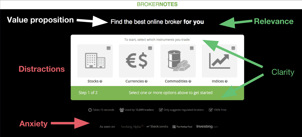
- Making the value proposition as clear as possible (“Find the best online broker for you”).
- Increasing question relevancy by segmenting visitors based on responses to the first question (which instrument they wished to trade in).
- Making the desired action clear by including written instructions on the first steps.
- Removing distractions by replacing the background image with a plain color.
- Illustrating that it’s 100% free and only takes 15 seconds to complete to reduce anxiety and friction.
Here are the steps we took to achieve these goals:
1. We Focused on Interactivity
Interactive content is more engaging than static content because it makes your audience do something, rather than passively read or watch it.
A Demand Metric study discovered that interactive content converts 70% of the time (versus 36% for non-interactive content). We ran with this idea and encouraged people to interact with the form by placing it on the homepage and promoting it on social media.

Adding this new form to the homepage of the site worked wonders, too. It’s the first thing that new visitors to the home page see, making it accessible and allowing them to immediately get involved.
2. We Enabled Image Select Questions
Image select questions reduce the number of clicks a person has to do to complete a form submission. You want to make this figure as small as possible.
Nobody likes spending (what feels like) two hours completing a form. Your audience is the same. You must make it as easy for them as possible. That’s what we aimed to do with our new form:

We switched out traditional drop-down questions in favor of image select question. That reduced the number of required clicks to just three (previously required nine clicks) and shaved valuable seconds off the time you need from a site visitor to complete the form itself.
3. We Used Conditional Logic to Fill-in Fields
The goal of this form was to make things as easy as possible for the user. We discovered that using conditional logic could shave more seconds off the form completion time. This would auto-fill information a user has already submitted and fills-in other fields based on that data.
For example: If we knew the person was visiting our site from the UK, we’d automatically fill-in the “Country” field, so they didn’t have to.
This was the final piece on our mission to create the perfect form because it contributed to personalization. That’s something that modern-day shoppers now expect, according to a report by Segment.
Final Takeaways
Revolutionizing something as staple as the form isn’t easy. What works for a banking firm won’t work for a beauty retailer; it takes lots of trial and error to discover which elements work well for your customer.
You don’t need to start from scratch. While we created a scalable solution in the form of Leadformly to implement these changes yourself, here are a few smaller tweaks you can apply today:
1. Place Your Content Above the Fold
The placement of your form is critical. Just like we did on the BrokerNotes website, your form should be above the fold—or at least in the first portion of the page that’s displayed without scrolling down.
Why? Because a study by Nielsen Norman Group discovered an 89% difference in how users treat information displayed above the fold versus below it.

2. Using a Single Column Layout
Multi-column forms can look overwhelming. Nobody wants to land on a website and be faced with a wall of text to access something. Don’t make your site visitors feel the same way.
Single column forms have a faster completion rate of 15.4 seconds at an average confidence rate of 95%, according to ConversionXL. Use them to your advantage.

3. Including Your Privacy Policy
If you’re concerned about privacy when browsing the internet, you’re not alone. Research by Arbor Networks found that 84% of internet users worry about their privacy, which could significantly impact your form submission rates.
However, including a link to your privacy policy is a fantastic workaround. It clearly shows a visitor how their information will be used—giving them more confidence in your brand and convincing them to hit submit.

4. Optimizing Your Call-to-Action
Calls-to-action are important. They prompt someone to submit your form. But you need to go beyond standard phrases like “submit,” “buy now,” or “enter.” In a world where consumers are becoming fussier about the content they engage with, you need to let your creativity shine.
Play around with the text you’re using in your form’s call-to-action—mentioning the benefit for your visitor, like this example by Freshbooks:

Final Thoughts
Now it’s time for the tables to turn. It’s your turn to experiment with your own forms. Whether you’re changing the placement, layout or style of question, we found split-testing new approaches to be the most effective way to supercharge our form conversion rates.
The post How We Boosted Conversions 4x by Revolutionizing the Form appeared first on Marketo Marketing Blog – Best Practices and Thought Leadership.


