Think about a time when you were on the train, walking to work, sitting in the airport, or simply laying on the couch, and you had to complete an online form of some kind (an order form, shipping form, survey, etc.) on your smartphone or tablet. Did you have a positive or negative experience? Did the mobile form you completed function properly? Was it easy to read and submit on your mobile screen?
Due to their convenience, as well as the fact that most of us are almost always carrying a device, mobile forms may be something you complete frequently. If the online form you’re completing has a mobile-friendly design, then this process really is a convenient one. However, if the form you’re trying to complete is not mobile friendly, you might quickly become frustrated, angry, or ditch the site completely.
In this guide, we’ll review the most effective ways to design your business’s mobile form to help you boost conversions and create a great user experience. There are a variety of ways to achieve this, including obvious action buttons, clear form fields, minimal form fields, automated actions, a beautiful design and layout, and more.
But before diving into all of those details, let’s first define mobile form design to better understand the concepts and guidelines we’re about to review.
Mobile vs. Desktop Form Design
Today, your website visitors aren’t just browsing your site, viewing your content, and completing your forms from their desktop computers — they’re also completing these tasks from their mobile devices. That means it’s absolutely critical for your form to be simple to review, complete, and submit via a mobile device.
Why Is Mobile Form Design Important?
Great mobile form design allows for a positive user experience which ensures a happy website visitor who’s more likely to convert to a customer and become a returning user.
The design, layout, and functionality of your mobile forms play a large part in your website’s overall user experience due to the number of people who browse items, make purchases, and shop via their mobile devices every day. If your forms aren’t mobile-friendly, you may experience fewer conversions, a loss in mobile site traffic, and an increase in unhappy and frustrated customers. And who wants that?
Why Should Mobile Form Design Differ From Desktop Design?
Think about the difference in the display or screen size between a mobile device, such as an Apple iPhone, which typically ranges from 4.7” to 6.1” in size, and an iMac desktop computer, which typically ranges from 21” to 27” in size. Clearly, it’s safe to assume a form that fits an iPhone screen wouldn’t fit a desktop screen perfectly.
If your mobile visitors cannot easily read, complete, and submit your form, you may lose their business. So creating a mobile-friendly form that fits the screen of any mobile device is crucial to creating a great user experience in order to leave a lasting impression on your visitors and help you boost conversions.
What Is Responsive Web Design?
If you want to take mobile form design a step further and ensure your entire website is functional on all types of devices, you can implement a responsive website design.
Responsive web design takes the user’s screen size, platform, orientation, and environment into consideration. This is a simple and effective way to create a great user experience since so many people are constantly visiting and browsing different websites on a variety of devices.
There are a number of ways you can make sure your site has a responsive design. For example, if you’re a WordPress user, there are several responsive WordPress themes that you can install and use to design your site. Additionally, if you’re building, or have built, your site with software such as Squarespace, your site may automatically come with responsive web design.
Today, responsive web design is a popular choice for businesses due to the sheer number of people visiting websites via a variety of different mobile devices. But for now, let’s get back to discussing mobile form design.
Mobile Form Design: 10 UX Guidelines
When creating a mobile-friendly form, there are some steps you’ll want to take to provide the best user experience possible for your visitors. Let’s review 10 of these UX guidelines that you can begin implementing in your own forms today.
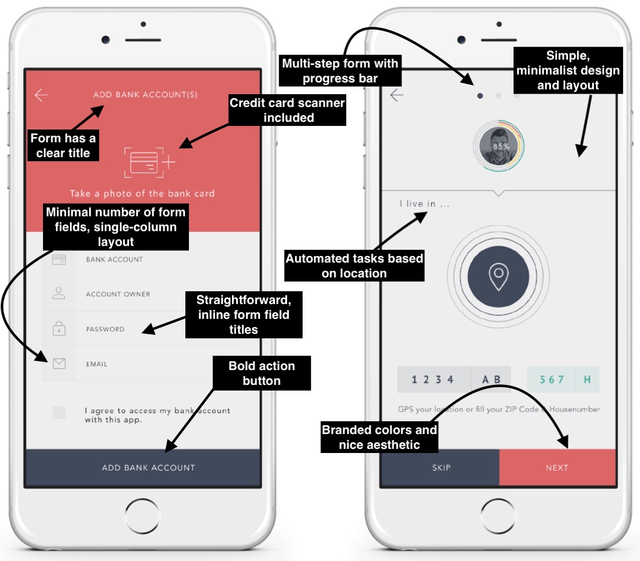
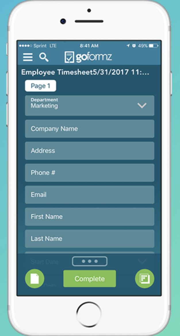
1. Minimize the Number of Form Fields
Ever heard the saying, “less is more”? Well, that’s exactly what you should be thinking while creating your mobile form.
Between the size of a mobile device’s screen, the amount of content you need to place in your form, and the number of form fields (form fields are the boxes in which your visitors add their responses), it’s easy to accidentally make your form feel cluttered. Remember to remove all unnecessary fluff and only keep the form fields for information that you absolutely need.
In addition to narrowing down your number of form fields to only the necessary, you’ll also want to make sure your form fields are labeled clearly with the fewest words possible. You should also mark the optional form fields as “optional” or include an asterisk next to the required form fields to streamline the process.
2. Automate Actions When Possible
If you accidentally mistype your street address and the form corrects the spelling for you, the form autocorrects your response.
If you begin typing your shipping address and a box pops up with the rest of your address asking you if you want to “autofill” the rest of the form fields with your saved address, then your form is autocompleting your response for you.
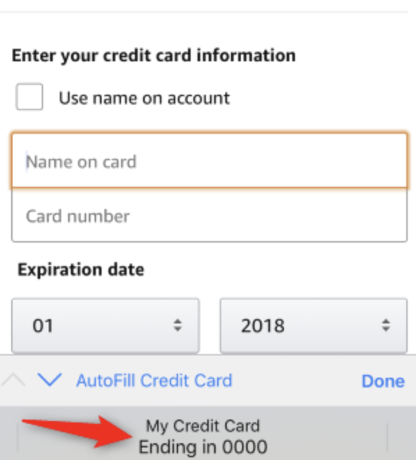
By implementing autocorrect and autofill features on your mobile forms, you’ll improve user experience through a quick, efficient, and straightforward process.
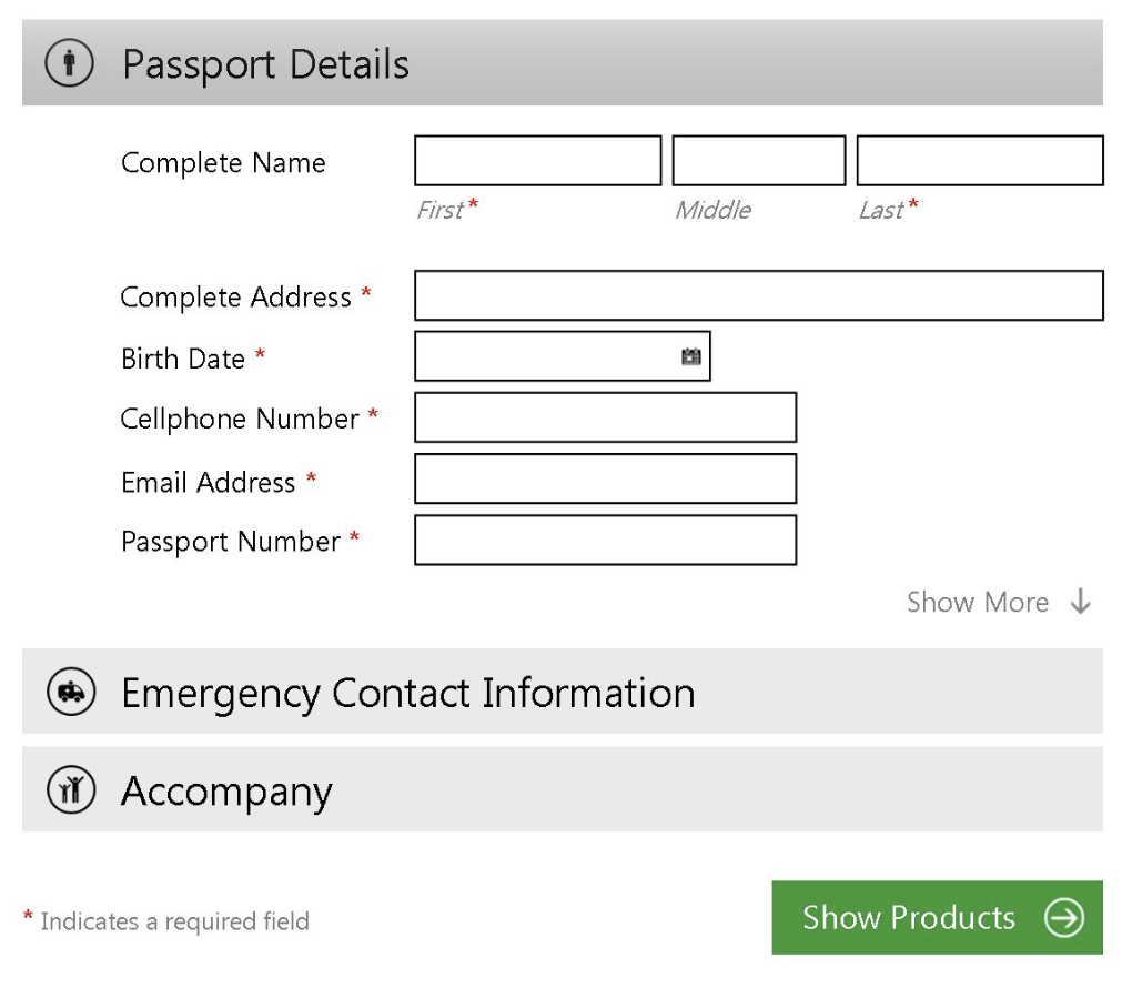
3. Use a Single-Column Layout
When you’re completing a long or multi-step form, list all of your content in a single-column layout.

This is true for forms on both desktop and mobile devices for a few reasons — single-column form layouts are:
a. Easier to read
Placing all of your form fields in a single-column format allows your visitors to focus on only one item at a time, making your form easier to read.
b. Less daunting
If you look at a form, especially in a tight space as you would on a mobile device, and see a large amount of content smushed together, you may feel overwhelmed. That’s why separating your content by rows and placing your form fields in a single-column format make your content look and feel less daunting.
c. Quicker to complete
When you place your multi-step form in a single column, leads are able to complete it more quickly than they would a multi-column form. That’s because the format makes the form easier to read and work through step-by-step.
4. Use Input Constraints for Form Fields
If your mobile form includes short or long responses, you should enable input constraints. Input constraints place a limit on the number of words or characters a person can type into your form field.
Writing long responses on a mobile device isn’t always easy due to the size of the keyboard and screen. And if a visitor is unsure about the amount of detail required for a response, they may over-explain, which could end up being a time-consuming process for you and your visitor.
An input constraint will typically say something like, “You’ve exceeded your maximum of ___ characters”.

There are other types of input constraints that limit input options, like dates on your forms. For example, if someone was trying to make a reservation for a table at your restaurant and accidentally selected a date in the past, your constraint would prevent them from actually being able to select and confirm that date. By setting input constraints, you’ll save your lead time while completing your form fields, and you’ll also prevent yourself from having to review a long-winded or invalid answer.
5. Create Clear Action Buttons
After taking the time to complete a mobile form, it’s likely that a lead will want to make sure their form is submitted properly to ensure you and your team are able to receive and review their information.
By using large, bold, and visible buttons labeled with clear actions on them, such as “Submit”, “Next”, or “Complete”, your lead will feel confident about their form submission. These action buttons help you streamline the form completion and submission processes for your leads to avoid any unnecessary confusion or concern.

6. Provide Scanners For Payments
Have you ever tried entering your credit card details in a form via your smartphone? Typing a bunch of numbers on such a small screen with a small keyboard can be a tedious process.
Card scanning apps, such as BlinkID and card.io, have become increasingly popular for that exact reason. When making a purchase, your visitors can click a button that takes them to a screen where they can use their mobile device’s camera to take a secure photo of the front and back of their card, whether that be their license or credit card.

With just a couple of pictures, your leads will be finished with one of the most time-consuming parts of your mobile form completion process. These card scanning apps keep your visitors efficient as well as frustration and error-free.
7. Explain Need For Specific Information
While completing a simple email signup or a registration form, have you ever been asked to provide personal information that has nothing to do with the signup form itself?
This is a common phenomenon in all types of forms (not just mobile). Asking someone for personal or other sensitive information without explaining your need for it can be a bit sketchy.

If you’re asking a question that doesn’t necessarily relate directly to the reason your visitor is filling out the form (whether the field is required or optional), then you should create some type of summary box or notification that they can click on to read a short description of the reason why you’re asking for this information. This way, your form will feel professional and thoughtful.
8. Provide State of Success or Completion
No matter what type of mobile forms you have on your website, you should provide your visitors and leads with their current state of progress, success, or completion while they work through them.
If you have a long, multi-step form, you should include a progress bar at the top of your form so your visitors are aware of how much longer they’re going to be working through the form.

Additionally, once your leads submit their forms, you should direct them to another screen or page that says something like, “Success!” or “Thank you for submitting the form!” so they know their submission worked.

9. Include Error Messages
While completing your mobile forms, your visitors are bound to make a mistake here or there. Your mobile forms should flag these errors in real-time so your leads can remain efficient and accurate.
For example, if someone adds the incorrect zip code alongside their street address, make sure your mobile form flags that error so there is no time wasted and your business is sure to receive accurate information.

In your message, give your lead applicable, easy-to-understand information that clearly shows the exact location of the error as well as how they can fix it.
10. Consider the Form’s Appearance
Appearance and first impressions in business always matter. That goes for your mobile forms, too, because nobody wants to complete a dark, difficult to read, cluttered, and unattractive form.
You want your mobile form to be highly functional as well as aesthetically pleasing. You can create a professional-looking form by branding it with your logo and colors. Your mobile form’s appearance should contribute to its readability and positive user experience.
To achieve this look, use:
- Simple, easy-to-read typography
- Minimal form fields
- Bright and bold action buttons
- Single-column layout
- A color palette that doesn’t feel overwhelming
Back To You
It’s no secret that, today, your website visitors are completing and submitting your web forms via their mobile devices. That’s because it’s convenient and efficient, as most people carry some type of mobile device with them everywhere, making it crucial for your forms to be mobile-friendly. Otherwise, your forms will be difficult to read, complete, and submit, which may frustrate your leads or cause you to lose their business completely. By considering your mobile form design and implementing these guidelines, you’ll enhance your mobile form user experience, build positive relationships with your leads and customers, and boost your conversions.


