A few years back, when I was getting my business up and running, I asked around for referrals to a CPA to help me with my taxes. Two people I trusted came back with names and glowing reviews. The first one sounded perfect, but when I got to his site, it had a bright green background and huge, nearly-unreadable blocks of text that was only broken up by a single logo that looked like it had been found on Google.
Despite that glowing review from a colleague I trusted very much, I couldn’t get past the site (which didn’t even have a contact form, but instead listed a @hotmail.com email address to contact him). That CPA was likely the perfect fit (the second was not and I eventually had to find a third), but his site was so awful it made me trust him and doubt his professional competency.
You don’t want that to be the case for your law firm, especially not when you need your clients to trust you with their lives, their families, and their businesses.
While most law firms know better than to use a solid bright green background and blue text (instant headache recipe, for the record), it’s more difficult to know where exactly to go next. We wanted to take the guesswork out of the equation, so we’re breaking down all the crucial elements that your law firm website design should have.
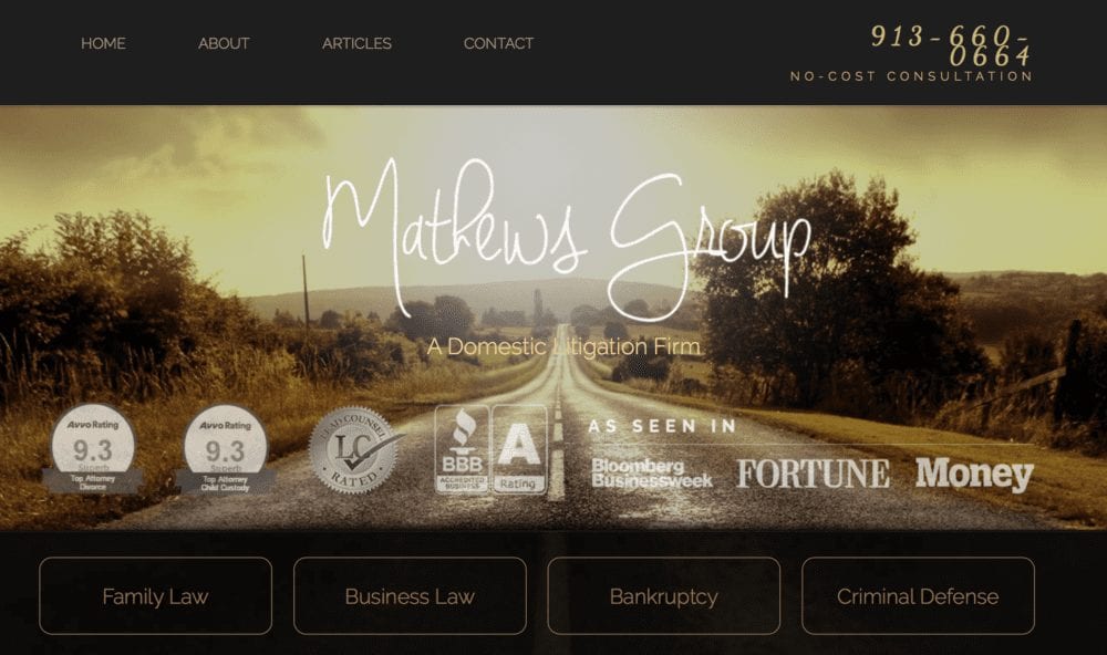
Intuitive, User-Friendly Navigation
There’s a game I like to play with sites I work with that I lovingly call “‘x’ marks the spot.” I ask my clients what services they offer and then—once I get to their site—I see how long it takes me to find the relevant information their clients will look for, including specifics on services or how the business operates. This should be nice and simple, but more often than not it feels more like a particularly un-fun treasure hunt.
That’s not the impression you want to leave your clients with.
If a potential client lands on your page for the first time, how long would it take them to find information about the lawyers at your practice, the services you offer, or your contact information? They should be able to find all of these immediately through a drop-down menu.
Depending on your law firm website design, it’s also helpful to have on-page CTAs that help users find what they’re looking for without even having to look at the navigation bar. This is particularly important for practices with different specialties.

If you’re unsure if your site’s navigation makes sense, ask an expert, a client, or a friend you trust to tell you the truth what they think.
Information Placed on Proper Pages
While I was doing research for this post, I looked at a lot of law firm websites. A lot. And what I noticed was that though a large number of firms had easy-to-understand navigation menus, many failed to divide up information and place them on the proper pages. This resulted in great big chunks of text that resembled a blog post or a white paper on the homepage instead of concise site copy.
It might look something like this:

Your homepage and landing page is not the place for you to go into every detail about your service, because all this does is overwhelms site visitors to the point where they won’t read any of it.
Instead, only feature a quick blurb on your homepage explaining what makes you unique. This helps to establish your branding and show clients why they should choose you. You can also include CTAs to contact you, or to learn more about your services.

Most firms would benefit from having site pages dedicated to:
- Each service or area of specialty they offer
- The lawyers and attorneys in the firm
- Testimonials and/or case studies if relevant
- Contact
- FAQs/blogs
The only pages that should be contain large amounts of text are your FAQs and blog posts. Even these should be broken up with formatting and subheads in order to make them more digestible.
By placing the right information on the right pages, it will be easier for users to find, process, and act on.
Lots of White Space
Sites with plenty of white space (also called “negative space”) are more visually pleasing. They’re also easier for users to process and take in, which can keep them on your site longer and help them to focus more on your now-easy-to-see CTAs.

Whether you’re tweaking your site or having a web designer do a full overhaul, make it clear that you want plenty of white space on your site. This lets you highlight what’s most important without overwhelming your audience.
High Quality Visuals
All visual elements that you put on your site should be high resolution and professionally created. This includes videos, logos, and images, and many law firms benefit from utilizing all three. Hire a professional photographer, a graphic designer, and a videographer, even if they’re expensive. You’ll only have to pay once, and it will be an investment that pays off tenfold.

To make sure you get what you want the first time, know how you’re going to use each. If you know that you want your photographs to have certain dimensions so that you can use them as header images, for example, establish that with both your photographer and your web designer up front.
Contact Information Everywhere, Supported by CTAs
Pretty much no matter where I go in my house, if I stick out my hand and turn on the spot, I’m almost guaranteed to touch one of my two dogs. At least one of them is always close by.
That’s how you want your contact information to be. No matter what page users are on, they should never have to look far in order to find your contact information. It should be right there, waiting for when they’re ready to use it.

Many law firm website designs take this into consideration, offering phone calls, secure messaging, and live chat all on one page. This is the one way where it’s good to overwhelm users; you want to give them the flexibility to contact you how and when they want to. For best results, support your contact information with strong CTAs like “get your free consultation by calling now” or “set up an appointment to see a lawyer this week.”
Need for Speed
If your site isn’t loading fast enough, it will have crushing affects on your business’s web presence. Not only will it lower your ranking in Google’s algorithms, it will also cause users to leave your page before they can find what they need. And users, they aren’t waiting around for long: According to Kissmetrics, 47% of users expect a site page to load in 2 seconds or less.
What goes on your site can unsurprisingly directly affect site loading speed. A large number of large image files being used for a slider of header images, for example, can significantly slow down site speed. Similarly, large pages often take much longer to load than shorter pages, earning another point for the “divide everything up” strategy.
It’s always a good idea to check for site loading speeds to know exactly where you stand. You can get an idea of how your site is measuring up with Pingdom.
Mobile Responsive
Is your site mobile responsive?
If you answered yes, are you sure? If you are, is it responsive on all major devices and browsers?
Mobile traffic is only continuing to increase (and has surpassed desktop traffic), so if you aren’t catering to mobile users, you’re likely going to miss a huge section of potential clients. Even if you think your site is probably good, check to make sure so you don’t leave users squinting at their phones in confusion.

Mobile responsive sites can contain a lot of the same information and it should match your desktop’s site branding, but you can cut out unnecessary images or videos to increase loading time. You should also make sure that the mobile design is formatted correctly, with text that is easy to read and aligned properly.
Conclusion
The ultimate law firm website design should be simple, intuitive, and aesthetically pleasing. Remember that you get what you pay for, so this is one area where it’s more than worth it to hire a great site designer, even if it costs a pretty penny. Ask to see samples of the designer’s work before they get started, and send them this list to explain what you want before the even head to the drawing board.
Not looking for an overhaul but unsure of where to go next for your site? We can offer landing page design and site design testing services to help you create the most high-performing website for your firm (learn more here).
What do you think? How do you feel about your law firm website design? Do you need to make any changes for optimal performance? Share your thoughts and questions in the comments below!
The post The Go-To Guide for Law Firm Website Design appeared first on Disruptive Advertising.


